Designing a UI to operate an AI Model

Context
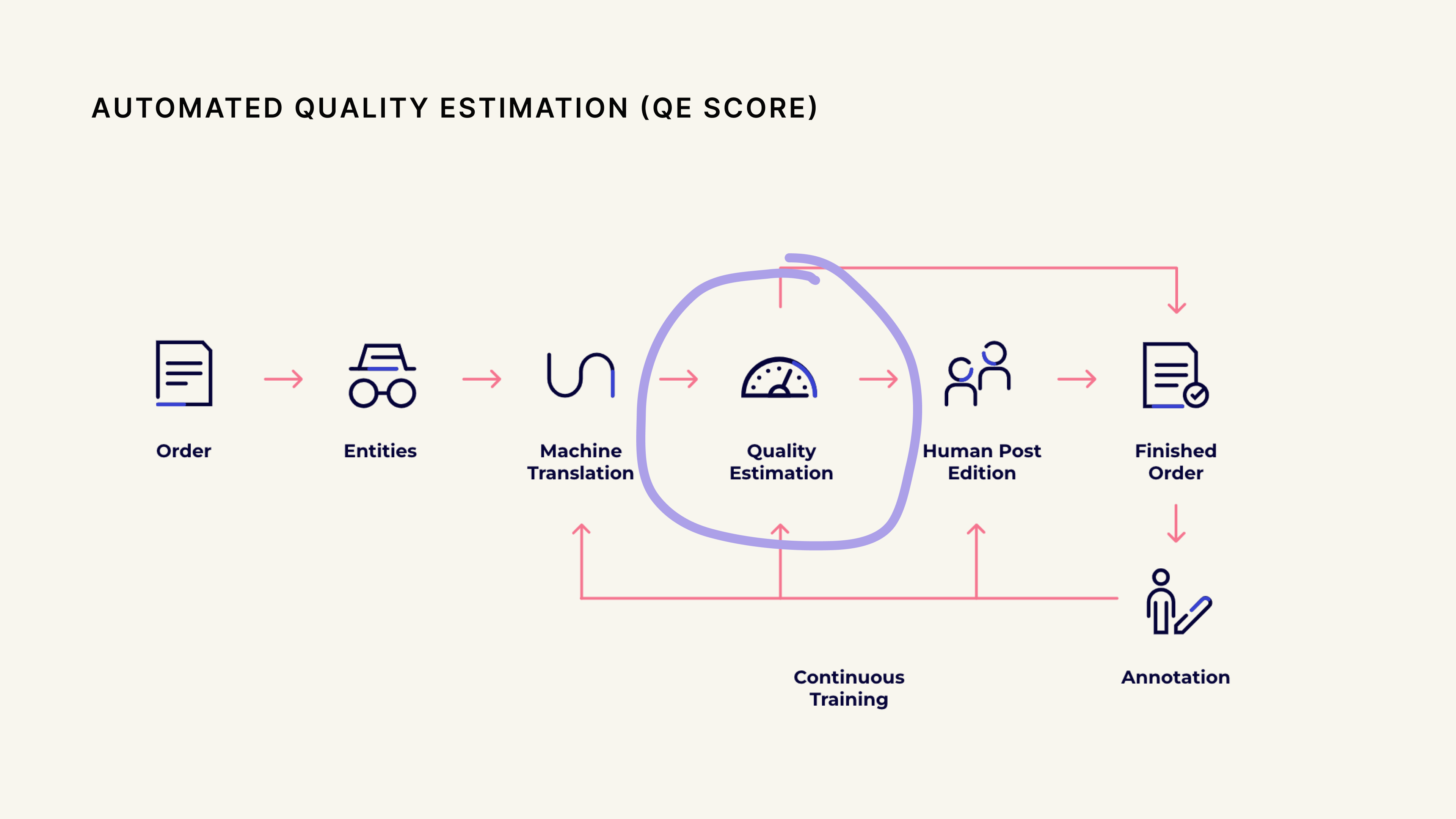
Unbabel uses a multi-step translation pipeline that transforms text from the source language into text in the target language, to produce customer specific translations at scale and speed (< 20 mins).
The QE model sits between the Machine Translation (MT) and Human Post-Edition steps. It measures the quality of the MT translation and decides if the translation needs to be further edited/improved by a human translator.
My role
My team was responsible for building the canvas experience and the modules in it while the AI team built a service wrapping QE configurations for us to consume. I collaborated with 2 product managers on this project, one on my team and one on the AI team to ensure that the interface aligned with user needs and with the underlying API.
The model worked. The interface didn't.
Designing a module for the workflow canvas brought with it a set of specific constraints. I worked through them with the front-end dev on my team and aligned with the designer on the adjacent team who was working on other modules.
Problem definition
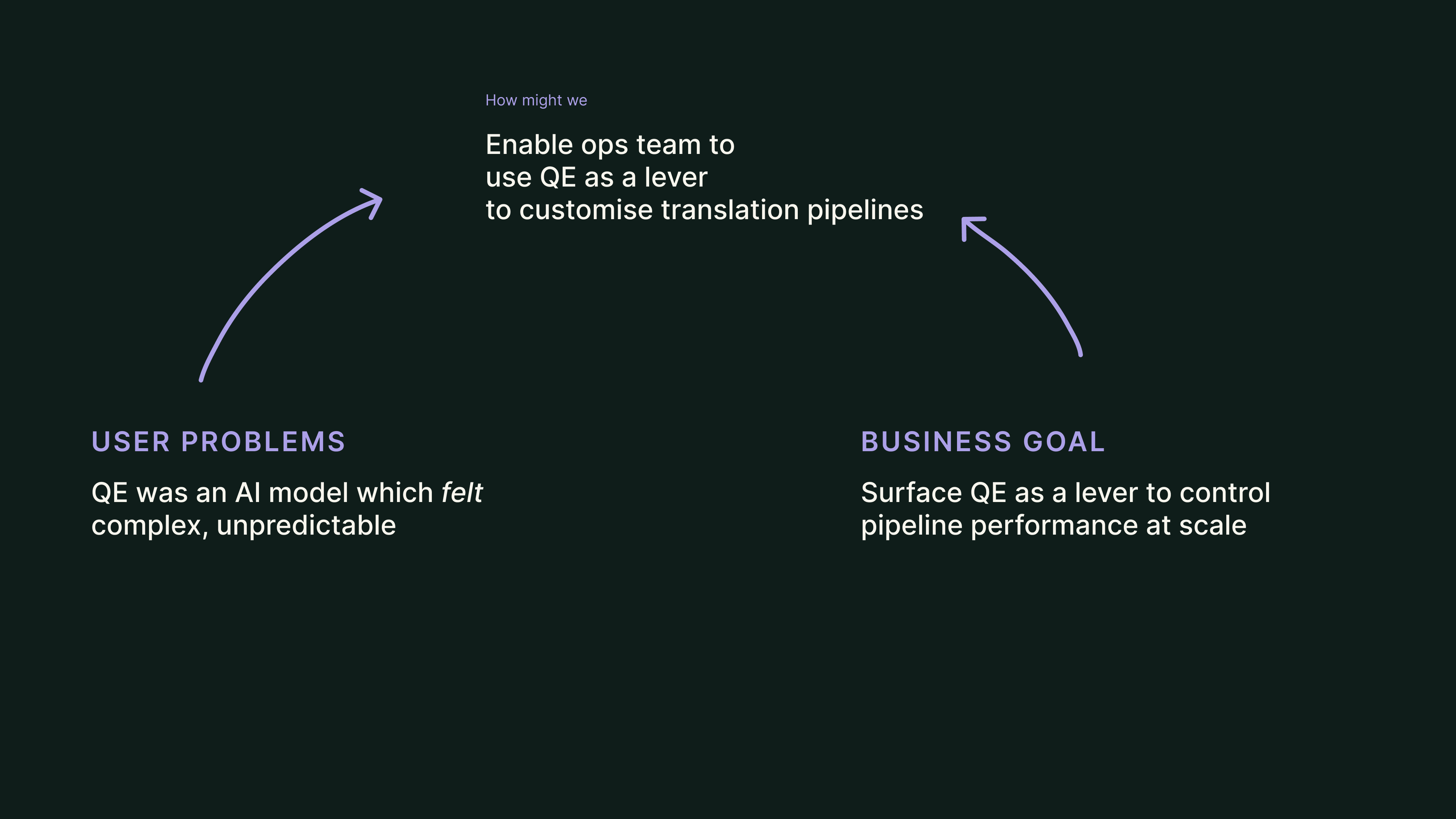
To surface QE for the ops team, we needed to map how QE would benefit the customer and then craft an interface that supported the ops team to make informed decisions.
Approach
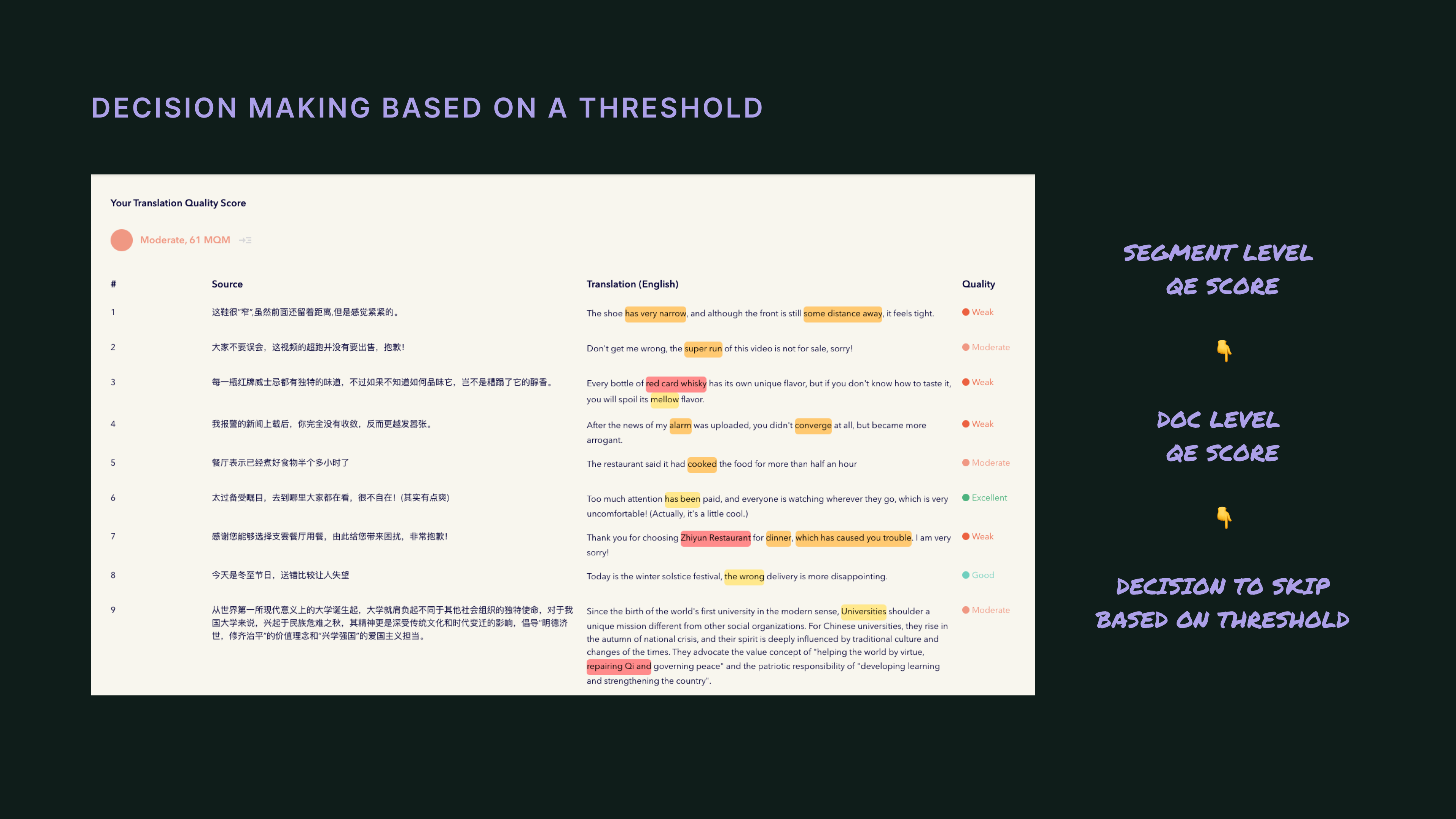
The QE model worked by predicting the quality of every translated sentence (or segment) and associating that predicted quality with a score, i.e quality estimate score (QE score).
Aggregating the segment scores into a document-level score allowed the model to have an understanding of the overall quality of the translated text.
Evaluating the document-level score against a threshold then enabled the QE model to decide if the translation needed Human Post-Edition or if it was good enough to skip Human Post-Edition.
Introducing QE into the platform
Since QE configurations would impact the overall pipeline's performance (quality), it felt logical to introduce QE configurations in the context of the entire pipeline.
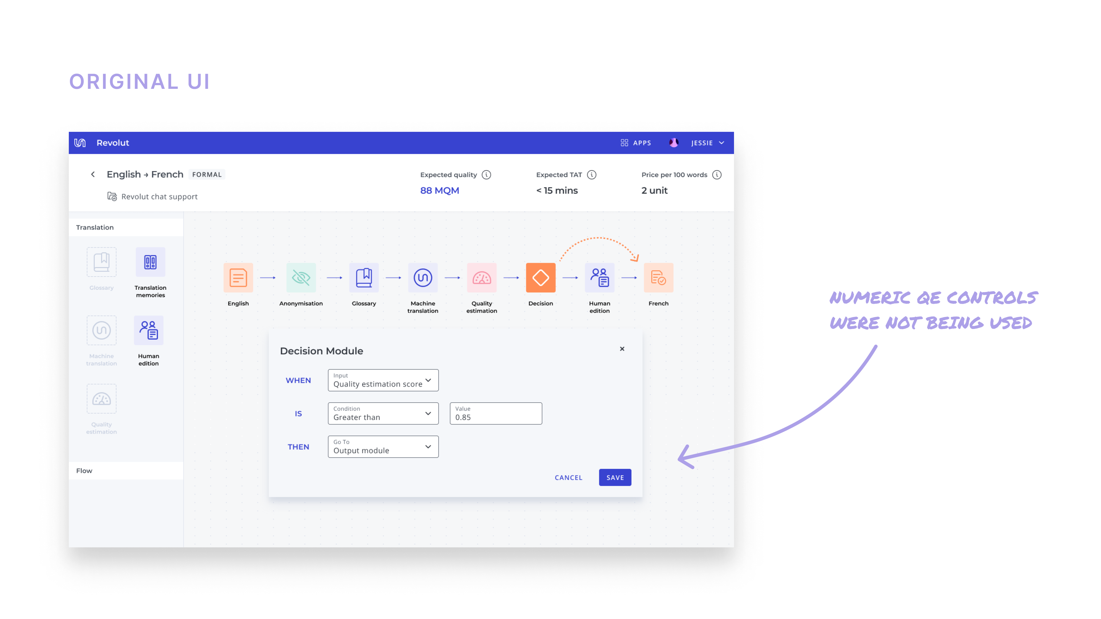
The QE model actually does two things — scores the translation and decides if the translation should skip Human Post-Edition (based on that score). Since we were only enabling configurations on the skipping behaviour, I proposed that we visually separate QE into two modules, giving rise to a brand new module that we named as the decision module.
The decision module would allow the ops team to configure only the skipping behaviour and contain all the skipping-related logic and tradeoffs. This directed the ops team to focus on the only thing they could control and simplified operating QE through a single mental model — its skipping behaviour.
Inverting the paradigm — "QE profiles"
Surfacing QE in the decision module resonated well but interacting with QE scores and threshold decimals was not intuitive at all. The primary challenge with numeric QE scores was that the ops team could never anticipate what the outcome would be.
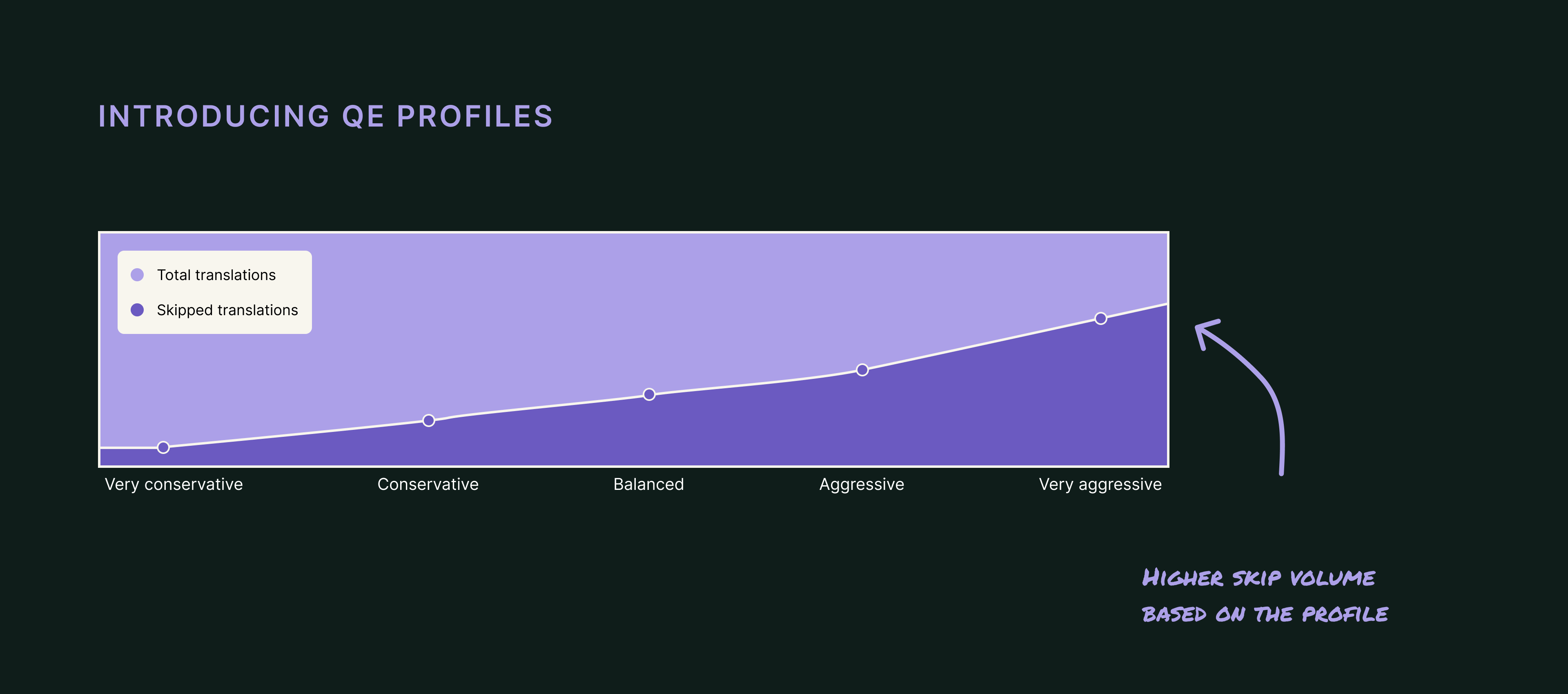
QE profiles were developed as an abstraction over the QE score based on whether the translation would skip instead of looking at the score itself.
This essentially inverted the paradigm and enabled us to interact with the QE model based on the outcome of its skipping behaviour.
Five QE profiles were developed by the AI team based on the skipping behaviour — Very Conservative, Conservative, Balanced, Aggressive, Very Aggressive. As the name suggests, more aggressive profiles would skip more translations.
Design iteration 1
QE profiles were a breakthrough in how we talked about QE internally and externally. To rework the decision module with QE profiles instead of QE scores, I realised I would need to start afresh.
Brainstorming with the AI engineers led me to my first breakthrough — to use the historical performance of the model. When the ops team would request them to intervene, their process involved looking at the quality of jobs skipped by the model in the past.
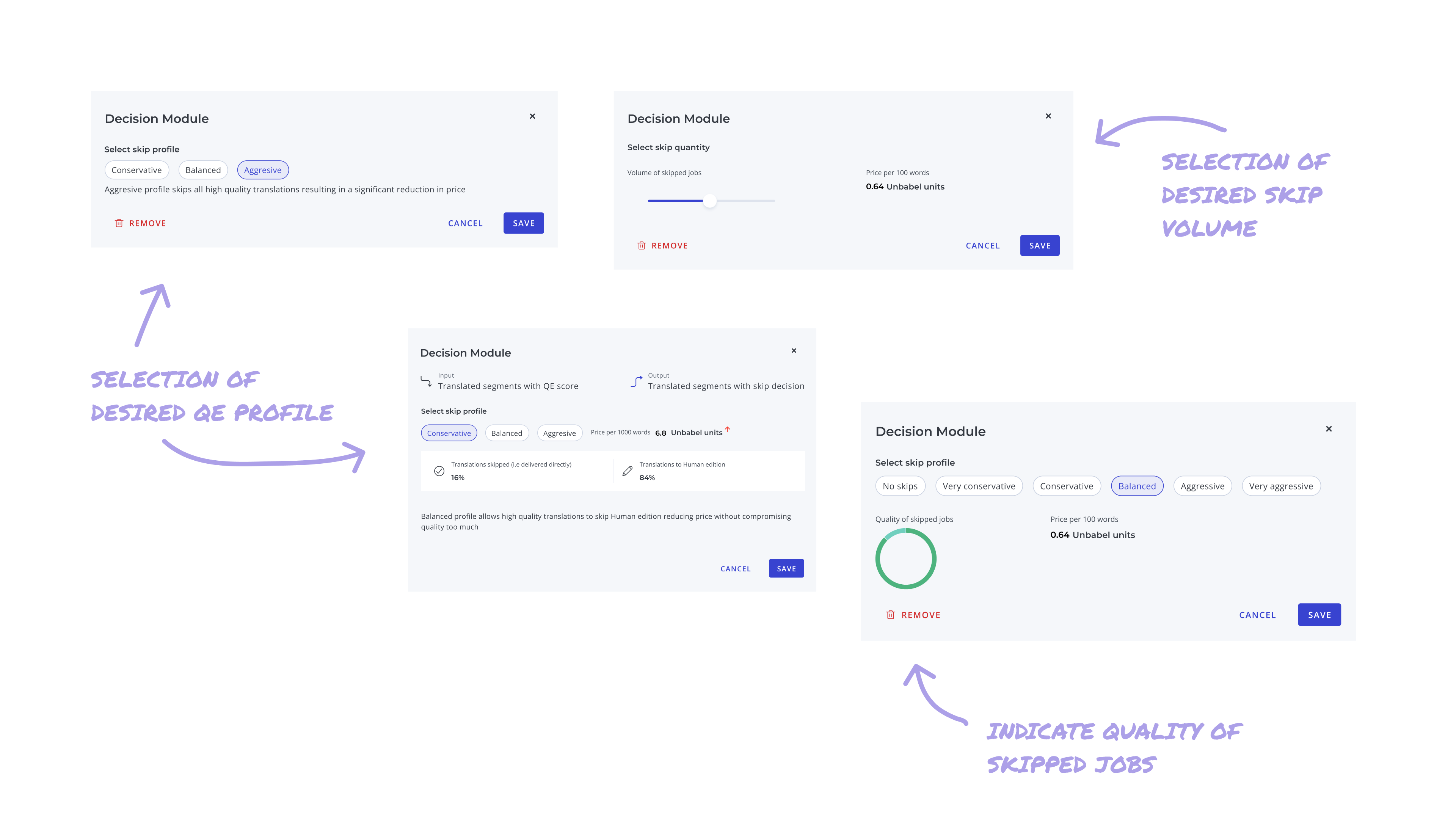
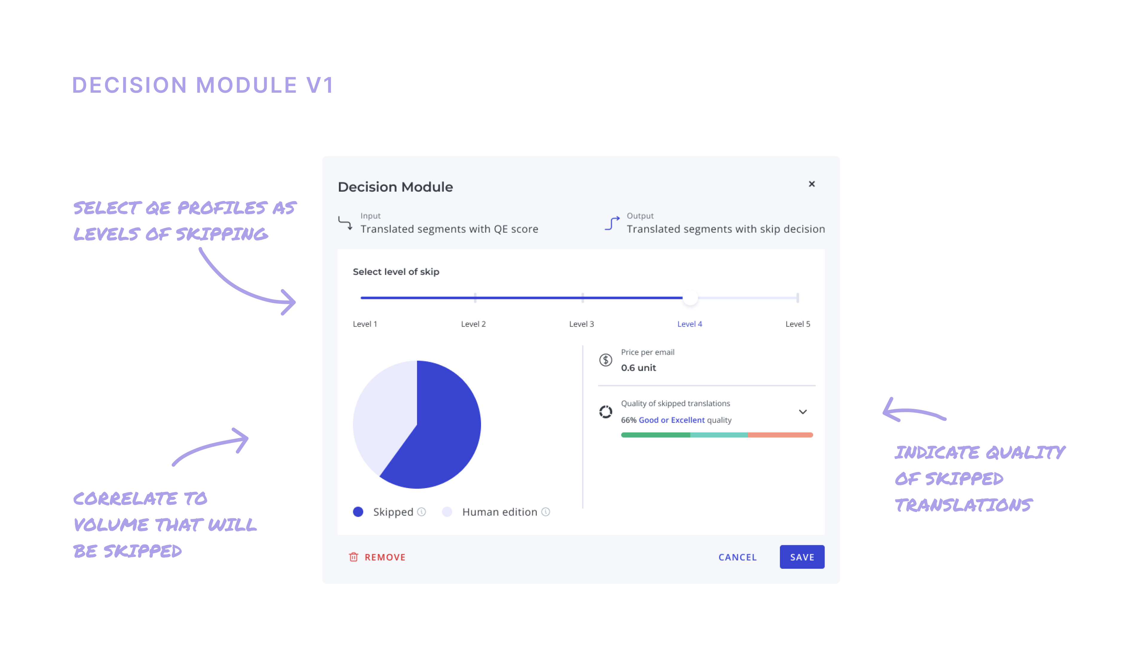
After much debate and multiple design reviews, the consensus was to
- Line up the QE profiles on a scale to explain linearity
- Highlight the volume of translations that will be skipped
- Visualise the quality breakdown of the skipped translations
- Indicate the impact on the unit cost of translations
In order to avoid working in circles, I decided to test this interface with the ops team in a moderated usability test.
Using this as a starting point, I developed visual concepts where the decision module would allow you to simulate the outcome on a pipeline when the QE profile was switched.
Testing version 1
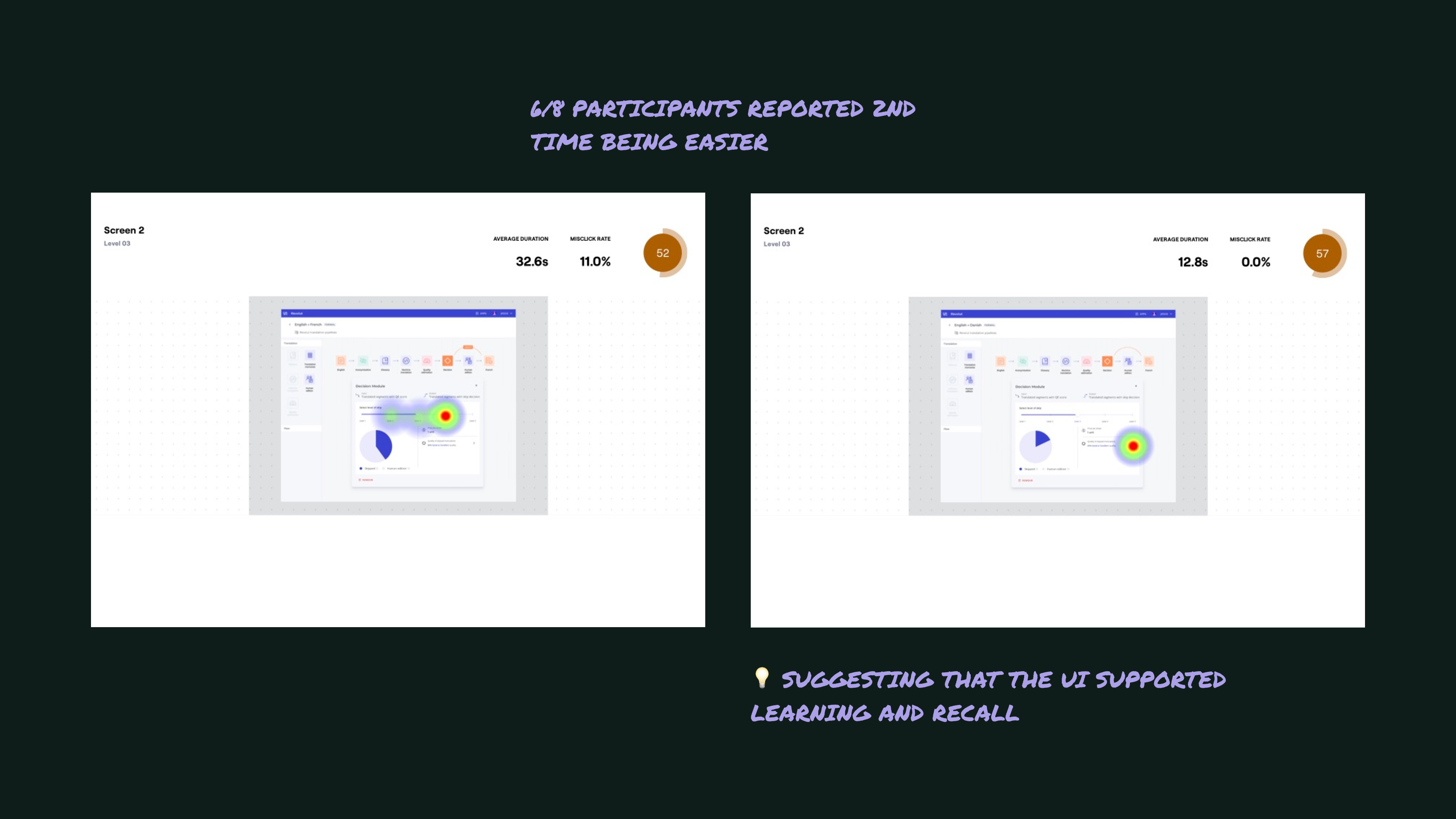
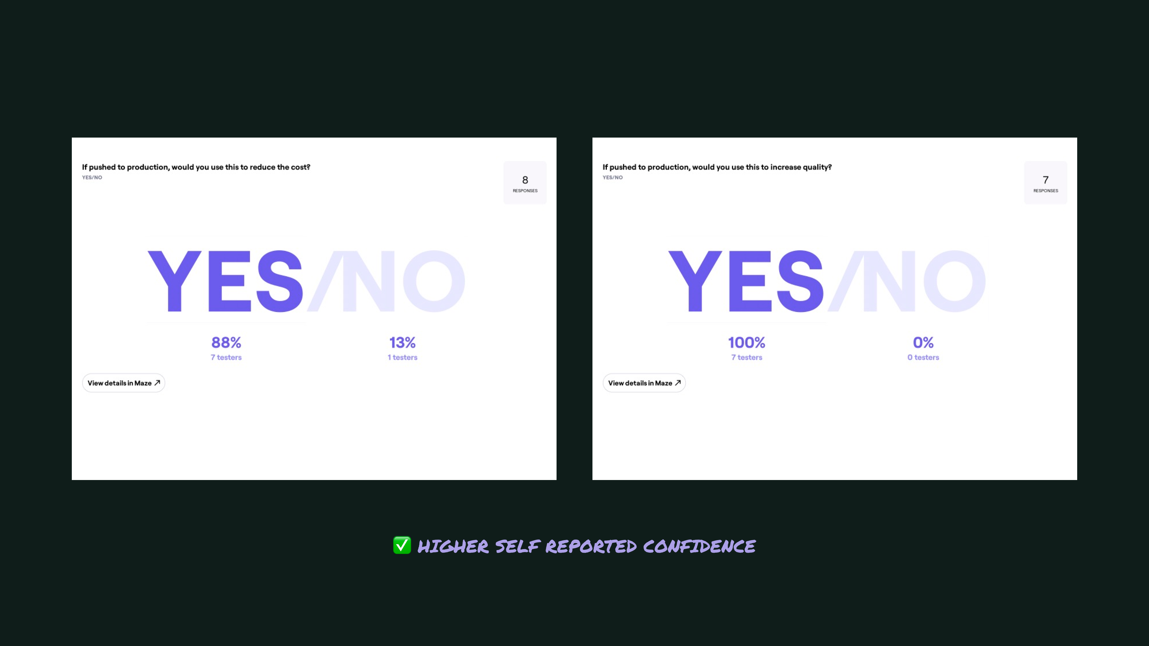
The above interface was tested with 8 participants in a remote moderated usability test. Each participant performed 2 distinct and independent tasks, followed by open feedback and a post-mortem discussion.
UXR findings
The results of the test were very positive with most participants keen to apply QE profiles to the customers they managed. Most importantly, it enabled me to build a mental model of how the ops team viewed QE and what their priorities were.
Design iteration 2
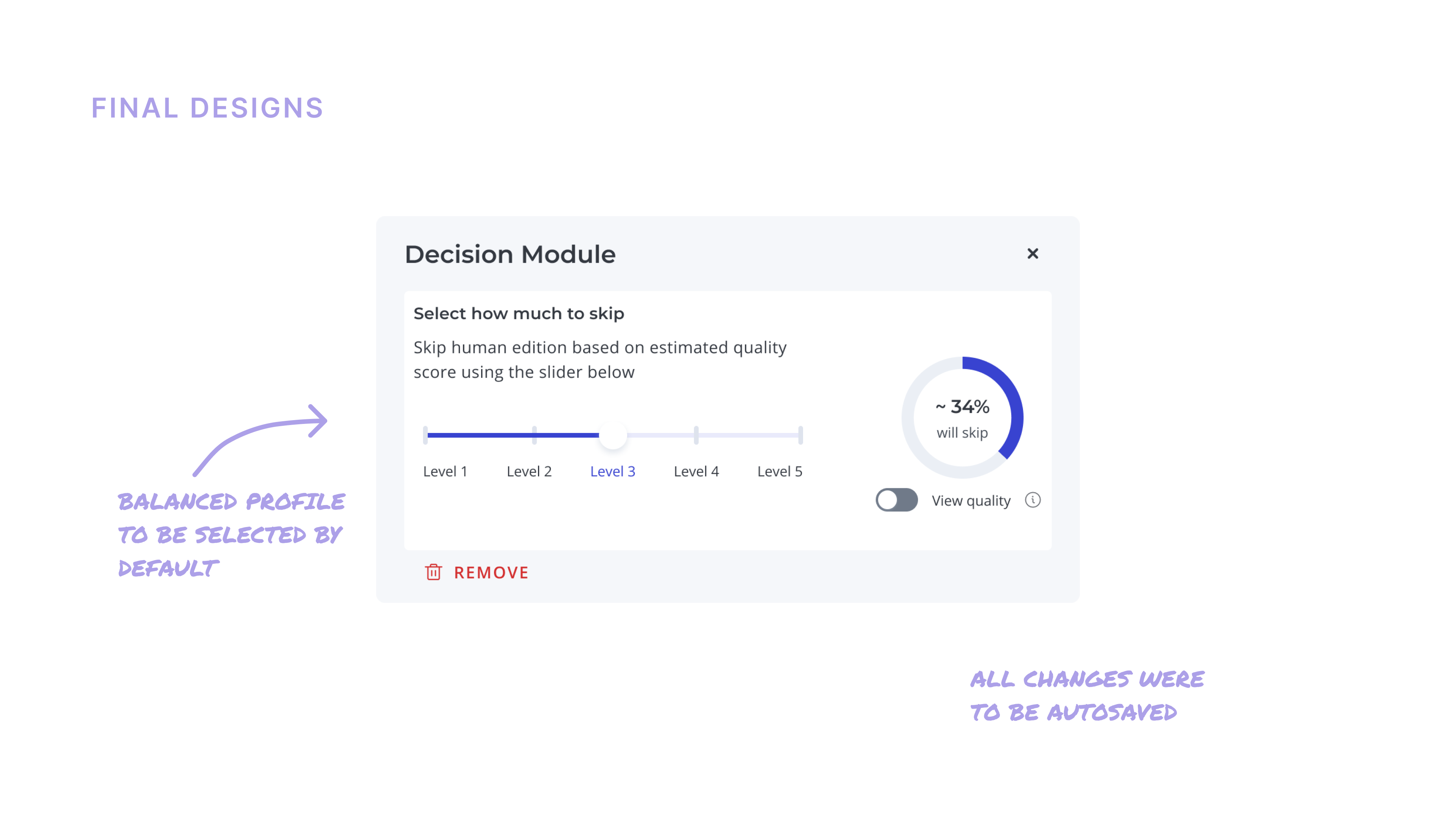
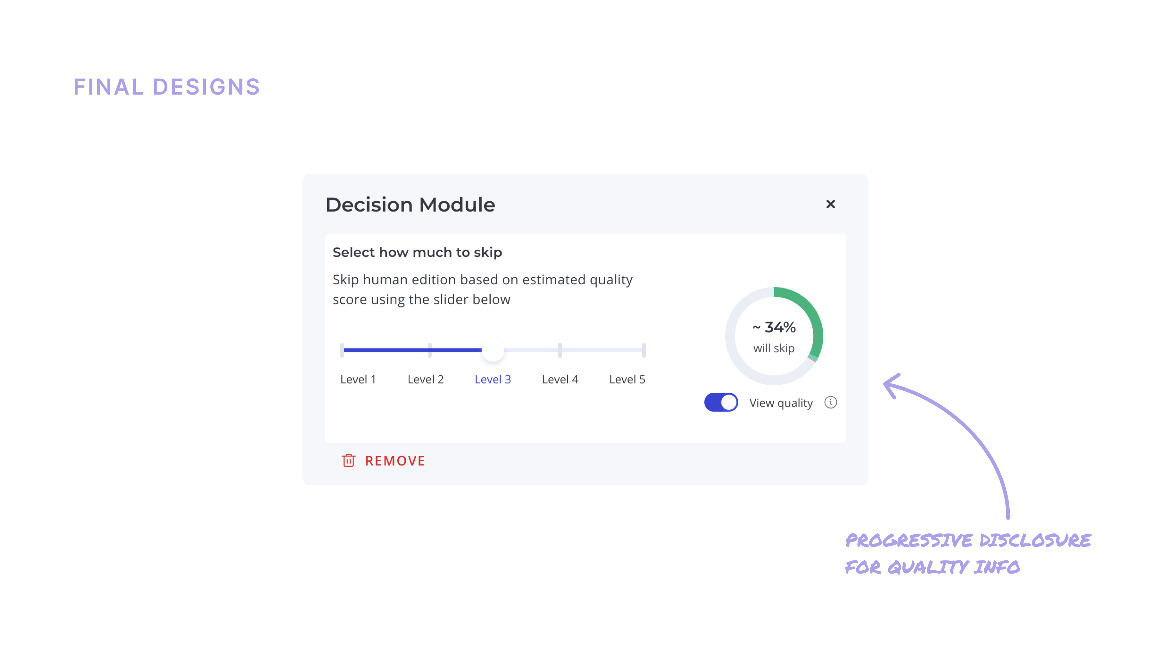
Armed with a higher level of confidence, I proceeded to clean up the interface and further simplify the design based on feedback from the usability tests.
The primary design decision I took here was to juxtapose the skip slider with the volume of jobs being skipped — making the direct relationship between them immediately visible.
Outcomes
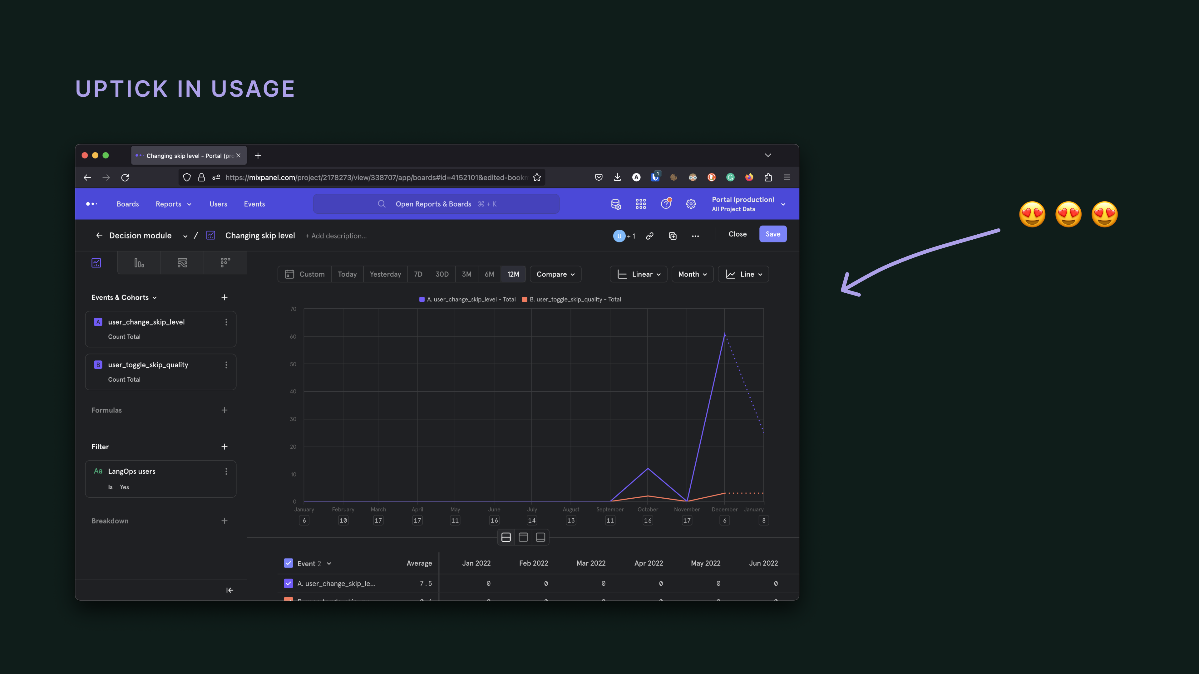
After wrapping up the designs, I handed over an instrumentation plan to the front-end dev as my final contribution on this project.
Feedback was positive on the 2nd iteration and after deploy, there was an uptick recorded in the activity in the decision module.
While we monitored usage and opened channels for feedback to inform future iterations, this project was closed with this deploy as we set about to build other parts of the platform!
Reflections
(updated 2026)Designing for an HITL interaction paradigm in 2022 was a very fun project. I keep this project in my portfolio because working through this with ML engineers shaped many of my instincts around
- designing with AI models,
- designing abstractions on top of AI models,
- truly internalizing the non-deterministic nature of the system.
During the course of UX testing, I also realised that no matter how many guardrails we introduce, only after a period of experimentation and constant tweaking, will the ops team gain the true confidence to rely on the decision module for their customer needs. This was undoubtedly just the beginning of this journey.